Best Practices for Responsive Course Design (RCD)
There’s no shortage of methods for creating eLearning these days. You’ll find many sources of information promoting many different methods of design. When it comes to creating Responsive Course Design™ (RCD), however, there are a few best practices that it’s important to understand when creating any content.
Desktop First
You’ve probably seen articles on Responsive Web Design advocating that you should “design for mobile first.” However, for RCD, we use inheritance from the desktop view to populate the mobile views, so you should always design for the desktop first. Content that you place in the desktop view will be automatically responsively positioned and sized for the other views–landscape and portrait on mobile devices. When you work with the mobile views, it will be much easier to remove or reposition content that might not be as important to the information you are trying to convey on that page.
It’s important to do as much of your work as you can from the desktop, and let the inheritance do the work for you. That way, any changes or updates you make to the desktop view are carried over to the mobile views without any tweaking necessary.
Start at the Top!
When converting a non-responsive title to RCD, or even starting a new RCD title from scratch, it’s important to set up all of your title level navigation and background images first on the desktop, and then make sure everything is working on all of the mobile views, before filling in all of your content. That way, you know how much room you will have to work with, and how things will be laid out on each of the pages.

Themes
Using one of the prebuilt themes within Lectora®, or creating your own, is a great way to get a head start in creating new content. Each of the themes has already been designed with navigation, headers, and footers specifically designed with RCD in mind, so you know that you will get a smooth working design in each responsive view without having to put in a lot of effort to get started.
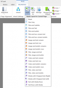
Page Layouts
Page layouts have been greatly improved with the RCD release of Lectora. Each layout now has specific layout properties for all five views within an RCD title. So, you can use one of the prebuilt layouts, or create your own custom layout and know that your content will flow correctly in each view without having to switch to each view to check it.
Background Images
In many non-responsive courses, a background image can be used that is the full size of the page, and all of the content items are laid out over that image. This is an issue in a responsive title in that a single background image is normally laid out for a landscape view only, and cannot be stretched into a portrait view without changing the aspect ratio of the image, creating unwanted distortion. Lectora will automatically scale the background image to the mobile views, while maintaining the aspect ratio of the image, which will not cover the entire screen.
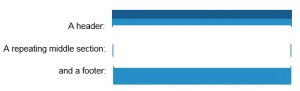
The responsive way to have a full size background image is to break it up into a header, a repeating body, and a footer. The header and footer would be added as images at the title level, and would be the same width as the desktop view, 1009 by default. The footer should have its position set to “from bottom,” ensuring that it will be at the bottom of each view. The repeating background would be set as the background image of the page, and would also be the width of the desktop view, but a small height. Lectora will automatically repeat the background image to fill the whole page. You’ll see many examples of this in the themes that Lectora provides. Let’s take a look at an example of a static background image, and how that would be converted.
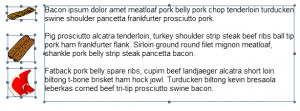
Let’s say we have a title with the following image set as its background:
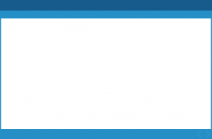
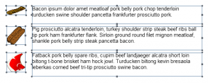
For a non-responsive desktop course meant to always be viewed in landscape mode, it would be perfectly fine as a single background image. It won’t, however, translate well to responsive views, especially portrait views, which will have greatly varying page heights, and therefore greatly varying aspect ratios. So, we break it up into three distinct images:
Offset from Bottom
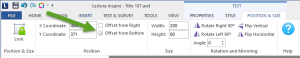
Lectora has always had the “Offset from Bottom” option on the position and size tab for all objects, but it takes on new importance for RCD. An object’s “Y” position is normally determined by how far the top corner of the object is from the top of the page it is on. When “Offset from Bottom” is selected on the position and size tab, an object’s “Y” position is determined by how far the top of the object is from the bottom of the page it is on. This is especially useful when the page size varies from view to view, the object will always be at the same place relative to the bottom of the page.
So all bottom navigation and footer objects should have the “Offset from Bottom” option set on their position and size tab. A good rule of thumb is that if it is at the bottom of the page, it should have the “Offset from Bottom” option set. You can look at any of the included Lectora themes, and note that all objects in the footer area have the option set.
Just Say No to Overlaying Image Objects on Text Blocks
When creating a page in Lectora, it may seem easy to line up several images within a text block by just leaving spaces in the text block and putting image objects over the blank areas within the text. This could work if you only had a single browser to produce output for. However, in today’s environment, you cannot guarantee which browser will be used to view the content, and text may be spaced differently within each browser, leading to the text and images not lining up.
In an RCD environment, it would be impossible to line up an image object over a space in a text block, as text block heights are changed and text is reflowed within the text block between views. And your content will be displayed in a great variety of browsers and devices, which will certainly display the text differently. So, what can you do when you have text and images that need to line up?
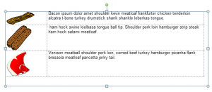
One thing that you can guarantee is that the placement of the top left of the text block will be at the position you place it at. So, for instance, if you have a text block with three paragraphs set up, and an image that is supposed to line up with each paragraph like this:
You could break the paragraph up and line each image up with a unique text block like the following:
This will ensure that the top of each text block will line up with the top of each image.
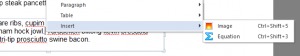
But what if you have small images that need to be inline with text? You can actually insert the image into the text, so that it will flow with the text. Just right click on the point in the text block where you want to insert the image and select “Insert – Image” from the menu, as shown below:
This provides another method of including images aligned with text, by placing the items in a table and including the images in the table, like the following:
Wrapped Text Is Your Friend
Another option that has been in Lectora for quite some time, but becomes more important with RCD, is the “Wrap Text” option in the text properties. Checking this option will cause the text to automatically flow around any image placed on top of the text block in the layering order. Images behind the text block in the layering order will not cause the text to reflow.

This can be a huge benefit when creating responsive titles, as the text will naturally flow around the image as it is resized in each view, as shown below:
The End of Flash
Responsive Design inherently means your title will be running on mobile devices, so any title produced for RCD should not contain Flash, as it will not have runtime support on these devices. For better or worse, Flash is completely unsupported on mobile devices, and so your content should not rely on it.
There are free utilities available on the Web that you can use to convert some simple Flash to HTML5, and then use the produced HTML in a Web Window within Lectora. Try out Swiffy at https://developers.google.com/swiffy/. It works very well at converting simple animation to HTML5, and may be all you need for your project.
Audio/Video Will Not Auto Start on Mobile
The major browsers on iOS and Android do not to support the autostart option for HTML5 media, making it very difficult to have auto started audio and/or video for your content. They require a “touch” of the screen in order to begin playing any audio. Interestingly enough, it is only a browser restriction. If you install the Firefox browser on your Android or iOS device, you will see that audio and video will auto start on each page on a mobile device when run from Firefox. Unfortunately, you will not know what browser your user will have, so you need to keep this restriction in mind when developing responsive courses.
Any “On Click” action (which equates to a touch on mobile), or a controller view, will be able to start media on a mobile device. So, when designing your page with media, look for a way to include a click to start it. That simple interaction can have the added benefit of keeping your users engaged with the content rather than just having it “auto played” to them.
Longer Pages, Vertical Scrolling on Mobile
Don’t worry about your pages in mobile view having a greater height than the physical screen of the device. Mobile pages have less screen real estate, and it is natural for users to scroll the screen with a gesture to read the content. It is absolutely how a responsively designed page should work in a mobile view. Remember that there are many, many devices out there, any they have many different sizes and aspect ratios, and you are building for all of them.
Much of our content in static page design has been built around exact size pages, fitting to a pre built theme height. In RCD, you can use all of the features of RCD such as “Offset from Bottom” and repeating background images such that you can use a designed background, but still allow the page to flow to its natural height, including all the information you need to, without feeling the need to cram it all into a predefined space.
Anchor Position
The Anchor Position feature allows you to specify whether an object will maintain its location on the page within the view, even when the view is scrolled. This is perfect for use in mobile courses to anchor logos, headers/footers, navigation controls, images, and videos.
This article last reviewed Dec, 2015. The software may have changed since the last review. Please visit our Release Notes to learn more about version updates.