Building Finger-friendly Buttons for m-Learning
When using Lectora® and Lectora Online e-Learning software to create m-Learning, it’s important to consider the usability and navigation of your course. Whether you’re building content for delivery on a smartphone or tablet, remember to design for touch. This naturally applies to buttons, which you’ll want to make “finger friendly”—easy to tap with the pad of your fingertip.
There are two ways you can create finger-friendly buttons.
The steps are almost identical in Lectora and Lectora Online. We’ll note any differences as we go along.
Custom Radio Buttons and Check boxes
If you’re using radio buttons and check boxes in your title, the default controls (which translate to the default controls used by your browser) might be too small for your intended device. In this case, you can take advantage of custom radio buttons and check boxes.
To add a custom radio button or checkbox:
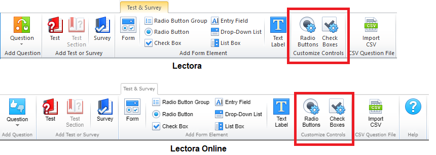
1. From the Test & Survey ribbon, select Radio Buttons or Check Boxes from the Customize Controls panel.
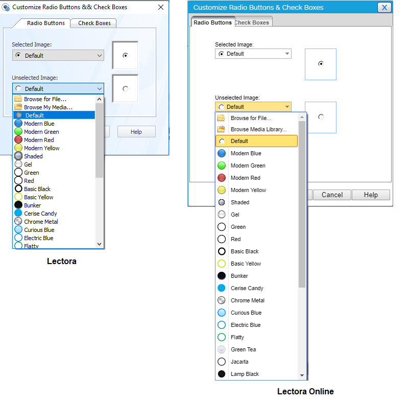
2. In the Customize Radio Buttons & Check Boxes dialog box, use the Selected Image and Unselected Image pull-downs to choose the images for the selected and unselected states for the button. You can pick from one of the default options listed or import your own custom image. All you need are two image files (any file format will do – png, jpeg, bmp or gif); one to show as the unselected radio button/check box, and one to show as the selected radio button/check box when your learner taps the button.
3. Click OK. Any forms or questions that use check boxes or radio buttons will now automatically use the custom images you’ve defined for your title.
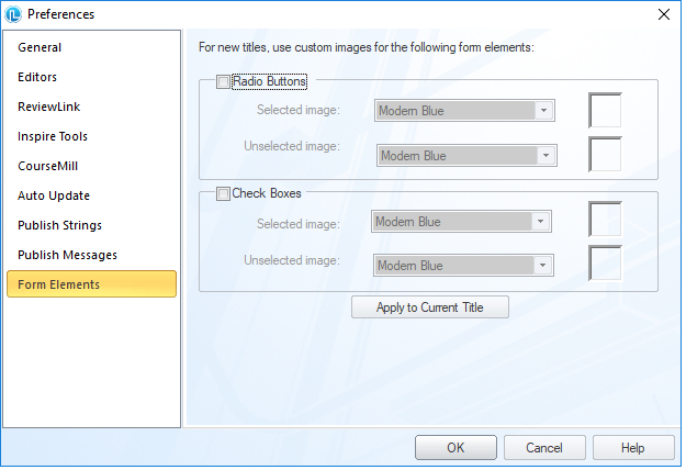
Note that you can also set these custom controls in your Preferences if you want to always use custom controls every time you build a title. You can find the same options by selecting File > Preferences, and clicking on the Form Elements tab:
Button Object
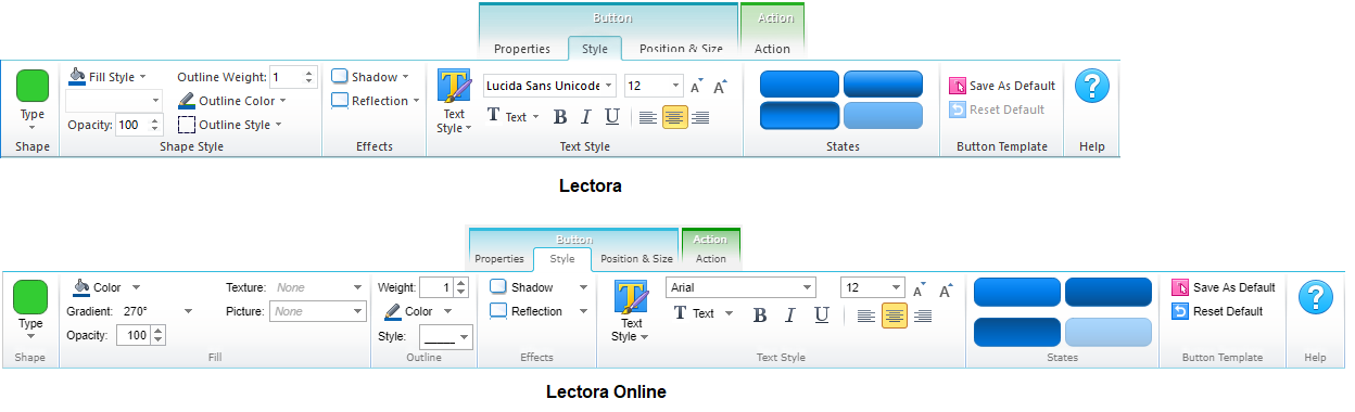
When using the button object, you can use the Style ribbon to customize the button’s shape, background, effects and font formatting.
For example, you can use Lectora and Lectora Online to design buttons that comply with the iOS Human Interface Guidelines, Google Design Guidelines and the Android User Interface Guidelines:
- Ensure that your font size is large enough to be legible on a mobile device.
- Use the Shadow effects to give the appearance of a raised button, which can help delineate sections of content on a page or help it stand out on a page with varying types of content.
- Take advantage of borders when you have buttons displayed in your content area (rather than within a navigation bar) to help learners distinguish the button from the rest of the content.
- Design buttons with background colors to help learners more easily tap the button when additional content on the page may be distracting, or when they reach a key decision point in your course.
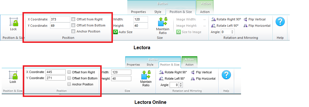
To set a specific width and height of a button, you can drag the handles on the adorners of the selected rectangle to resize the button, or use the Position & Size ribbon. Keep in mind that you can select Offset from Right and Offset from Bottom to create buttons that are always at the bottom of a page, regardless of its length.
A recent study by the MIT Touch Lab of Human Fingertips to Investigate the Mechanics of Tactile Sense found that the average width of the index finger is 1.6 to 2 cm (16 – 20 mm) for most adults. This converts to 45 – 57 pixels, which you can use as a guideline* when creating buttons in Lectora and Lectora Online.
*Keep in mind that pixel density can change depending on your device, resulting in a different size of the actual rendered buttons. Always test your content on your intended delivery platform.
This article last reviewed Dec, 2015. The software may have changed since the last review. Please visit our Release Notes to learn more about version updates.