With Lectora® and Lectora Online you can tailor the look and feel for each of the following button states:

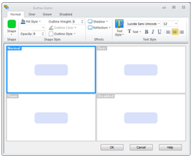
- Normal: The default state of the button—this is how the button looks when a page is initially displayed.
- Over: The state of the button that is revealed when a learner hovers the mouse over the button.
- Down: The state shown when the button is clicked.
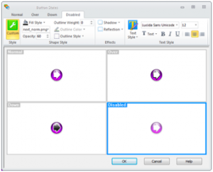
- Disabled: This state will be displayed if you trigger a Set State action to set the button to disabled. We’ll go over this in more detail below.
For each state, you change the shape style or modify the text style.
The steps are almost identical between Lectora and Lectora Online.
Consistent Properties for All Button Types
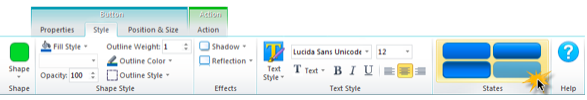
In Lectora and Lectora Online, you’ll notice that all button types—text, stock, transparent and image buttons—have the same set of properties on the Style ribbon. This allows you to take advantage of the new style features regardless of the kind of button you’ve added to your title. For example, you can change the shape of a transparent button (hot spot) to a circle, polygon or rounded rectangle. You can also add text to an image button or add a shadow or reflection effect to a text button.
Default Formatting
Let’s take a look at the States dialog that opens when you select the States button on the button’s Style ribbon. While you can always customize each state, by default, the states properties are based on which type of button you’ve added to your title:
For a default text button with a gradient fill, Lectora will automatically define the Over and Down gradient style based on the Normal state. The Disabled state will display the same image as the Normal state, but with a 60% opacity setting.

By default, transparent buttons will look the same for each state—an opacity of 0. Remember, transparent buttons are not visible on the page once published, but they will have a blue tint in Edit mode so you can easily locate them.
Both image and stock buttons already have a defined image for the Normal, Over and Down states. The Disabled state works just like text and image buttons.
Automatic Updates from the Normal State
By default, any change you make to the Normal state will automatically apply to the other three states. This will save you a significant amount of time if you want to make a basic change to your button. For example, if you change the button’s shape, fill style or text style from the Normal tab, you’ll see these changes updated on the other states’ tabs as well.

Customize the Over, Down and Disabled State
However, what happens if you want to make a change to an individual state? For example, you may want to change the gradient style for the Over state, add an outline to the Down state or modify the opacity setting of the Disabled state. You can do that by changing that state’s mode from Auto to Custom. Simply click the Auto icon to toggle to Custom mode, which will enable the individual properties on the tab.

Setting a Button to Enabled or Disabled
Use the new Set State action to set a button to disabled (to display the Disabled state) or enabled (to display the Normal state). With this action, you can conditionally set the next button to disabled on the last page of your course, or until the learner has completed a question, game or interaction on the page.

This article last reviewed Dec, 2015. The software may have changed since the last review. Please visit our Release Notes to learn more about version updates.